by Daniel | Aug 27, 2017 | Data
Some technical details about the process for the Hansard data analysis project:
- Downloading Hansard transcripts (XML) from the Parliament of Australia website using a Python script (some Javascript hackery was required to get the proper path)
- Python with BeautifulSoup to parse the XML and write individual words to a local database, with a reference to the Member along with the context of the word (session, time, speech, question, answer, etc)
- Stripping out punctuation, numbers, apostrophe + ‘s’, URLs, etc.
- Dealing with some “interesting” data at times:
<span style="font-style:italic;">Bringing </span>, <span style="font-style:italic;">t</span>, <span style="font-style:italic;">hem </span>, <span style="font-style:italic;">h</span>, <span style="font-style:italic;">ome</span>
- Python dictionary keys to determine the ongoing unique words (and count) for each member
- Google Cloud Platform to try BigTable, BigQuery and Datalabs
- A realisation that my laptop could manage the DB and queries as long as I was prepared to wait occasionally
- Juypter Notebook
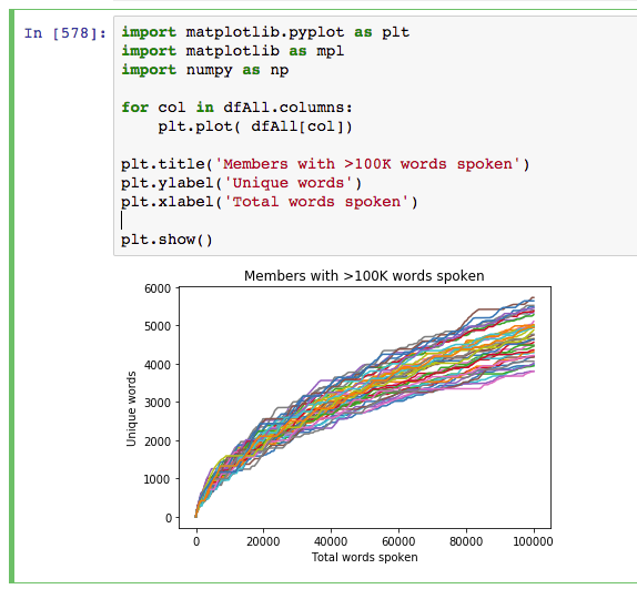
- Wrangling the data with numpy, panda and matplotlib
- Plenty of research on Stack Overflow

by Daniel | Aug 16, 2017 | News
After this blog was hacked one too many times due to issues with my US-based hosting provider I have finally managed to move the site to a local business. As part of the move I’ve also migrated the domain from blog.sitedaniel.com. The theme has also been updated from the very simple theme I’ve had on this blog since Feb 2008.
It’s been 4 years since my last blog post and I’m now planning to start to post more regularly again.
Stay tuned for a post about a side project regarding data visualisation that I hope to be able to publish in the next month or so.
by Daniel | Apr 11, 2013 | Data, Development

Recently I’ve been having a great time playing with Splunk. Splunk is a big data platform that allows you to search practically any machine data and present it in ways that will give you insight into what you have. It has practical applications for application management, IT operations, security, compliance, big data as well as web and business analytics.
I downloaded the free trial version, installed it locally and played with some personal data sources including phone bills, bank statements, my personal twitter archive as well as some weather data I downloaded from the Bureau of Meteorology.
Below are a few of the interesting charts that came out of my Twitter archive (@dan_cake), along with the basic search query used to extract and present the data in this way. Click to view a full-sized version.
Tweets by month

sourcetype=twitter_csv
Tweets peaked in July 2010 when I sent on average almost 4 tweets per day. The first drop in usage is probably due to the birth of my first child and then the subsequent months where there was hardly any usage is due to just being too busy at work and at home.
Tweets per hour of day
sourcetype=twitter_csv | stats count BY date_hour | chart sum(count) By date_hour
Most tweets were sent between 9am-5pm but there is an dip around lunchtime and an interesting smaller increase in usage between 9pm-11pm. What really surprised me about this was the volume of tweets sent between 1am and 5am. Drilling down into the data is seems that some of these are due to issues with the timezone of the device I was on.
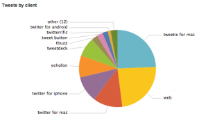
Tweets sent by Twitter client

sourcetype=twitter_csv | rex field=client "<*>(?<client>.*)</a>" | eval client=lower(client) | top client
Also I was surprised by this. I know I have been searching for the perfect client but had forgotten just how many I have been through!
The search query involved stripping some HTML tags from some of the client values with regex as well as matching on lowercase to get around inconsistencies with the same client having different capitalisation.


Recent Comments