Expenditure Map – Rewired State
On the weekend I went to “National Hack the Government Day” here in London, organised by Rewired State. (Rewired State runs hackdays where developers show government what is possible, and government shows developers what is needed.)
It was a great day and a chance to collaborate with other developers on a project of our choosing. I have been meaning to get into data-visualisation for a long time, but hadn’t managed to actually get around to building anything, so this day was a great opportunity to finally put something together.
I teamed up with Gareth Shapiro, flash/flex developer I have worked with before, and Ian Shortman, who found the data and managed most of the back-end.
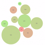
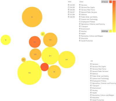
 We settled on an animated map showing the relative spending by different regions across the UK, using a set of circles that scale and change colour according to the relative values in the data.
It was an intense build as we only had a day to get a demo working, but it was very rewarding and I enjoyed the experience.
The end product is by no means polished and ready to go, but it shows what 3 developers can achieve in a day, and is a good starting point for more data-visualisation projects.
There are two colour pickers that let you choose the colour gradient of the regions, so you can quickly customise the way this looks, and radio buttons to choose the data sets to display. Thanks to Keith Peters (BIT-101) for the easily integrated components from minimalcomps. The project is Flash (AS3.0) with a MySQL and PHP back-end.
The project demonstration at the end of the day went well and the Expenditure Map was awarded one of the two Vodaphone-sponsored prizes which was unexpected but a nice surprise.
The project page at Rewired State is: http://rewiredstate.org/projects/expendituremap
and it can be viewed here: http://ishortman.com/projects/expendituremap

Recent Comments