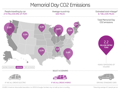
I’ve been a long-time admirer of the work of David McCandless (http://www.informationisbeautiful.net/), and I finally had the chance to build one of his infographics in Flash. The project displays projected CO2 emissions from car journeys on Memorial Day across America. You can choose between 3 region groupings and 3 fuel types. The numbers involved are mind-boggling!
Featured Posts
Recent Posts
Recent Comments
Categories
- actionscript (89)
- Data (4)
- Development (2)
- Featured (2)
- Machine Learning (1)
- News (2)
- Tools (5)
- Uncategorized (8)
- WordPress (1)
Archives
- May 2018 (1)
- March 2018 (1)
- August 2017 (3)
- April 2013 (1)
- August 2012 (1)
- June 2012 (2)
- May 2012 (1)
- April 2011 (1)
- January 2011 (1)
- October 2010 (1)
- September 2010 (2)
- August 2010 (2)
- July 2010 (3)
- June 2010 (2)
- May 2010 (2)
- March 2010 (1)
- January 2010 (5)
- December 2009 (3)
- November 2009 (4)
- October 2009 (3)
- September 2009 (6)
- August 2009 (2)
- June 2009 (4)
- May 2009 (5)
- April 2009 (4)
- March 2009 (2)
- February 2009 (3)
- January 2009 (2)
- December 2008 (3)
- November 2008 (1)
- October 2008 (4)
- September 2008 (2)
- August 2008 (6)
- July 2008 (4)
- June 2008 (1)
- May 2008 (7)
- March 2008 (2)
- February 2008 (8)

Looks great Daniel!
I like that you’ve combined number crunching with some nice subtle Flash effects such as the balloons waving around a bit.
Thanks Gareth!